Tag: DS106

  • Assignment B Story Telling:

    Reflection:

    For this assignment, i recorded myself reading a short story I focused on speaking clearly and using a chill and relazed tone to keep the listeners engaged. The biggest challenge was trying not to stutter and keeping a steady pace throughout the whole recording.

  • Assignment B: Breaking news

    Reflection:

    For this assignment, I created a breaking news report about UMW Women’s Soccer qualifying for the NCAA Tournament (which actually did happen this past fall). I used a news-style script and intro and ending music to make it sound more like a real sports update. This assignment helped me practice using audio to create a soecific tone and style which worked well for this assignment.

  • Assignment A:

    Reflection:

    For this assignment, I created an audio project that captured different sounds from a day in my life. The recording begins with my alarm clock sound, next is a walk in the morning with all the bird sounds, the keyboard clicking is me doing homework, then the sounds of me at the gym, some relaxing music while I do some more homework , and then I ended the night with a quiet room with me going to bed. My goal was to tell a story using everyday sounds rather than narration which was fun to do.

    This assignent made me pay closer attention to sounds that I normally ignore. Recording and arranging the clips helped me think about how audio really can tell a story even without any speaking. The biggest chalenge was finding sounds that clearly represented different parts of my day while also keeping the recording easy to follow.

  • Audio Story Analysis: Modern Love

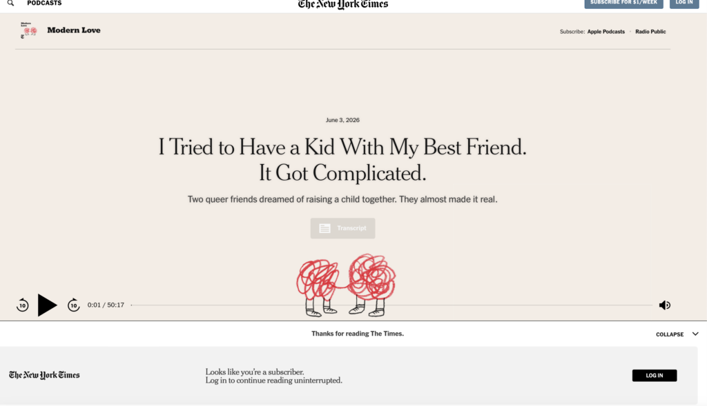
    For this assignment, I listened to the Modern Love episode “I Tried to Have a Kid With My Best Friend. It Got Complicated.” The episode tells the story of a man who considers having a child with his best friend after years of joking about the idea. What begins as a casual conversation then eventually turned into a serious plan, but the process became a lot more complicated than either of them expected. They work through questions about parenting, relationships, family dynamics and the story explores the challenges that come with creating a unique family.

    One of the things I liked most about the episode was how honest and personal it felt. The narrator openly shared his thoughts and emotions, making it easy to understand his perspective. Rather than just simply explaining what happened, he focused on the emotional impact of the experience and the difficult decisions that were involved.

    A couple different audio techniques were used to strengthen the storytelling. The pacing of the episode changed based on what was happening in the story, like during more emotional moments, the narrator slowed down and took pauses that gave listeners time to think about what was being shared. Background music helped set the mood without taking away attention from the story, and the mix of music and narration made the episode more engaging to listen to.

    I also noticed the Modern Love radio introduction at the beginning of the episode which immediately established the identity of the podcast. There were very few sound effects or environmental sounds used throughout the episode, which seemed intentional because it kept the focus on the narrator and his story he was sharing. The moments of silence stood out to me because they made important ideas and emotions feel a bit more meaningful and I think that these choices made the story feel more intimate and helped me better understand the emotions and challenges the narrator was experiencing.

    After completing Part II of this assignment, I defenitley paid much more attention to these production choices than I normally would. Before learning about audio storytelling, I mostly focused on the content of a podcast. Now I notice how pacing, music, layering, radio bumpers, sound effects, ambient sounds, and silence all contribute to the way a story is experienced by listeners.

    Overall, this episode helped me better understand how audio storytelling works. The narrator’s delivery and the audio techniques used throughout the episode worked well together and helped keep listeners interested. This showed how small production choices can make a big difference in how a story is experienced.

    Episode Link:

     https://podcasts.apple.com/au/podcast/i-tried-to-have-a-kid-with-my-best-friend-it-got-complicated/id1065559535?i=1000770919747

    Link to the The New York Times if the first link doesn’t work:

    https://www.nytimes.com/2026/06/03/podcasts/best-friends-parenting-kid.html?

  • What I learned about Sudio Storytelling from Ira Glass

    After watching Ira Glass’s four part series on storytelling, I learned that good stories need both action and a reflection. One thing that stood out to me was his point that a story is more than just sharing information. A story needs events that move forward and make the audience wonder what will happen next, and he also explains that reflection is important because it helps people understand why those events matter. I thought this was pretty interesting because I feel like it’s easy to focus on what happened and forget to explain why it is important.

    Image source: Wikipedia contributors, Ira Glass, Wikipedia. Wikipedia article on Ira Glass

    Another idea I found interesting was how storytellers create curiosity. Glass talks about how good stories keep the audience asking questions and then slowly answer those questions throughout the story. This keeps people interested and wanting to hear more and when he explained this, I started thinking about podcasts and videos I enjoy and realized they use this technique all the time. For example, some of the Youtube videos I enjoy watching, many of these creators start with a question or challenge at the behinning of the video and then slowly reveal the answer as the video goes on. I don’t always notice it but the curiosity is what keeps me watching until the end.

    The part of the series that stuck with me the most was when Glass discussed the gap between your taste and your ability. He explains that beginners often get frustrated because they know what great work sounds like, but their own work is not at that level yet. I found this pretty encouraging because it reminded me that improvement takes time. His advice was to keep creating, practicing, and learning from your work.

    Overall, the series helped me underatand that strong storytelling takes more than just having a good idea. It requires structure, reflection, and the ability to keep an audience interested. The biggest lesson I took away is that becoming a better storyteller is a process, and the only way to improve is to keep practicing.

  • Design Week Summary

    Links to My Design Projects

    Reflection on The Vignelli Canon 

    https://pmccausland.com/assignments/reflection-on-the-vignelli-canon/

    Design Blitz

    https://pmccausland.com/assignments/design-blitz/

    Visit New York

    https://pmccausland.com/assignments/visit-new-york/


    Dessert Display Edit 

    https://pmccausland.com/assignments/dessert-display-edit/

    Times Square Adventure

    https://pmccausland.com/assignments/times-square-adventure/

    Summary Reflection

    Throughout this design unit, I learned that good design is much more than just making something look visually appealing. Design involves careful decisions about color, spacing, typography, balance, and organization. Reading The Vignelli Canon helped me understand the importance of simplicity and creating designs that communicate clearly. I also learned how different design principles can be applied to everyday projects such as posters, photo edits, and advertisements.

    One thing that was harder than I expected was creating designs that looked simple while still being effective. I found that it was easy to add too many effects, colors, or design elements, but much harder to create something clean and organized. Making the Times Square photo edit look somewhat realistic was also challenging because I had to pay attention to placement, size, and overall appearance.

    One thing that was easier than expected was finding examples of design concepts for the Design Blitz assignment. Once I started paying attention to my surroundings, I noticed examples of balance, rhythm, dominance, and minimalism almost everywhere. The photography portion of the project was a lot more enjoyable than I thought it would be.

    The most frustrating part of the unit was making sure every assignment included all of the required parts, such as links, credits, additional media, and reflections. Keeping track of all the assignment requirements took extra time.

    The part I enjoyed most was creating the visual projects. I liked experimenting with Canva and different editing techniques to create posters and photo edits. My favorite project was the New York travel poster because it allowed me to combine photography, typography, and design concepts into one image. Overall, this unit helped me become more aware of how design influences communication and how visual choices affect the way people interpret information.

  • Times Square Adventure

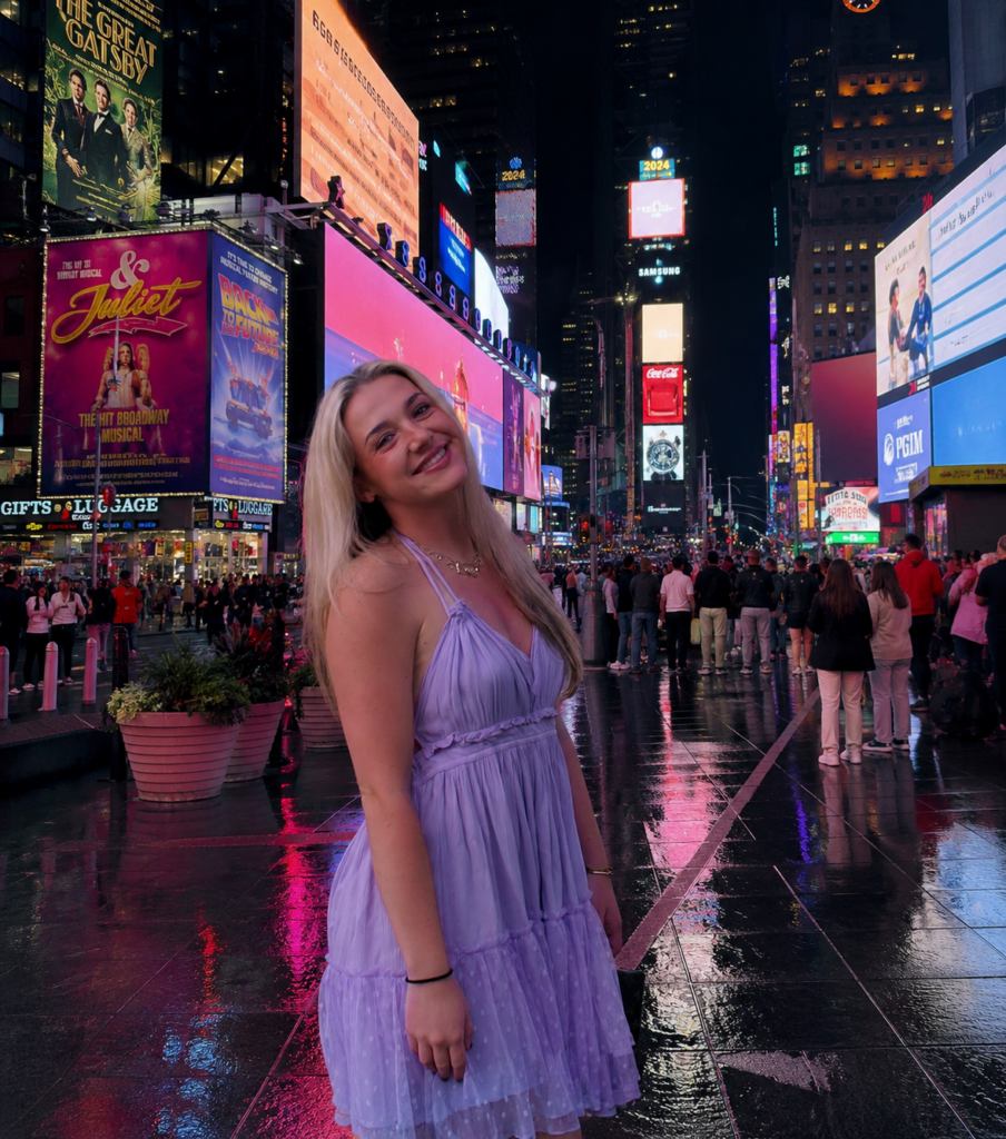
    Background image from Safari, created using photoshop and canva.

    For this design assignment, I decided to place myself into a photo of Times Square in New York City. I chose Times Square because it is one of the most recognizable locations in the world and is known for its bright lights, advertisements, and big atmosphere. My goal was to create an image that looked realistic while also making it seem like I was actually visiting one of New York City’s most famous landmarks.

    To create this image, I used photo editing tools to combine a photo of myself with a background image of Times Square. One of the biggest challenges was making sure the lighting, size, and placement looked a little bit natural. I had to carefully position myself within the scene so that I blended into the environment instead of looking like I had simply been pasted onto the image, since the original image my legs were not pictured.

    This assignment helped me better understand how photo manipulation can be used to tell a story and create a different reality. Small editing choices can completely change how viewers see an image. I also learned that successful photo editing requires attention to detail because even the small mistakes can make an image look unrealistic. Overall, this project helped me practice digital editing skills while creating a fun image that places me in a location I love and enjoy visiting.

    Related Links

    DS106 Design Assignment Bank: https://assignments.ds106.us/types/designassignments/

    Created using Canva: https://www.canva.com/

    Created using photoshop:https://www.adobe.com/products/photoshop/landpa.html?

    Additional Media

    https://www.timessquarenyc.org

    For my additional media, I included the official Times Square website. The website provides information about the history, attractions, and events that make Times Square one of the most famous destinations in New York City. It helped provide additional context for the location featured in my edited image.

  • Dessert Display Edit

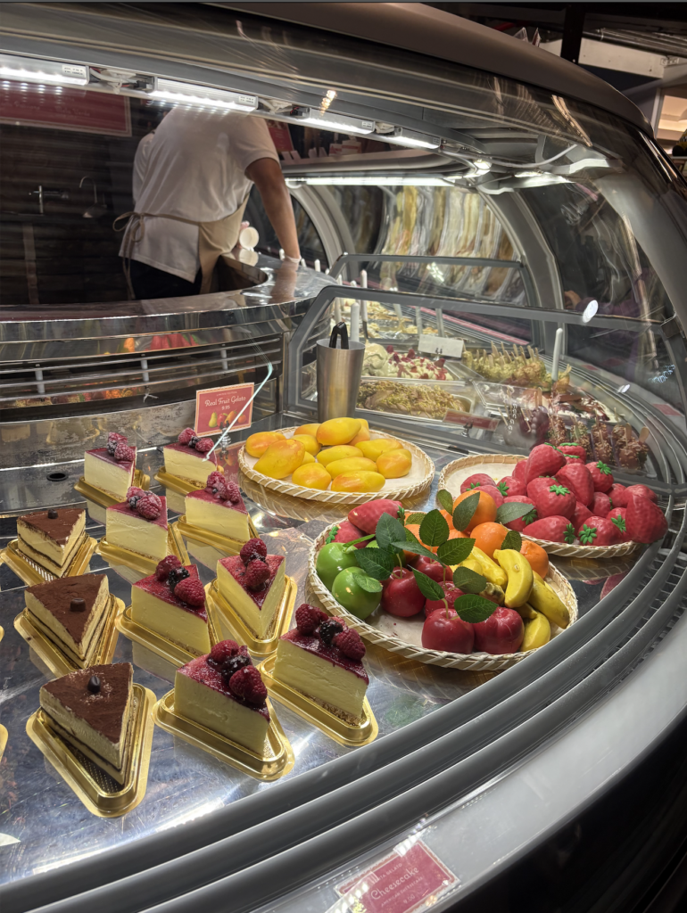
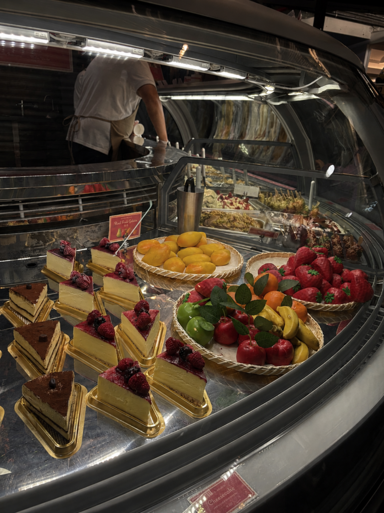
    After

    Before

    Original photograph taken and edited by me, edited using Camera app.

    For this design assignment, i chose to edit a photo of a desert display when I visited New York a wekk ago because I thought the colors and lighting would create an interesting visual effect. I wanted the image to feel somehwat vibrant and eye catching while still looking realistic. The different desserts, fruit decorations and reflections in the glass helped create a detailed image with a lot of contrast and my goal was to make the desserts stand out more while also creating a cleaner and more dramatic apperance.

    To create this edited image, I used photo editing tools to chang the brightness, contrast and sharpness. I focused on making the reds of the cherries and strawberries, yellows from the banana and mango and the greens from the stems stand out more because they helped grab attention and made the desserts look more appealing. One challenge was keeping the image looking somewhat realistic while still making the colors brighter. I also focused on balance so the dessert at the front of the image would be the main focus.

    This assignment helped me better understand how editing can completley change the mood and focus of a photograph. Small changes in color, lighting and contrast can make an image feel more dramatic. I also realized that editing should improve an image without making it look unrealistic. Overall, this project helped me practice visual design, color balance, and photo editing techniques while learning how design choices affect the way people view images.

    Related Links

    DS106 Design Assignment Bank:
    https://assignments.ds106.us/types/designassignments/

    Additional Media

    https://www.magnoliabakery.com/?srsltid=AfmBOopDZT9M8PyXZAhrjXJKRL3M5063VvOGfddTIeEEgHhb6pjL12iE

    For additional media, I included the Magnolia Bakery website. The website shows many of the desserts and baked goods that inspired the photo I edited for this assignment. Looking at the professional food photography on the site helped me understand how color, lighting, and presentation can make food appear more visually appealing.

  • Visit New York

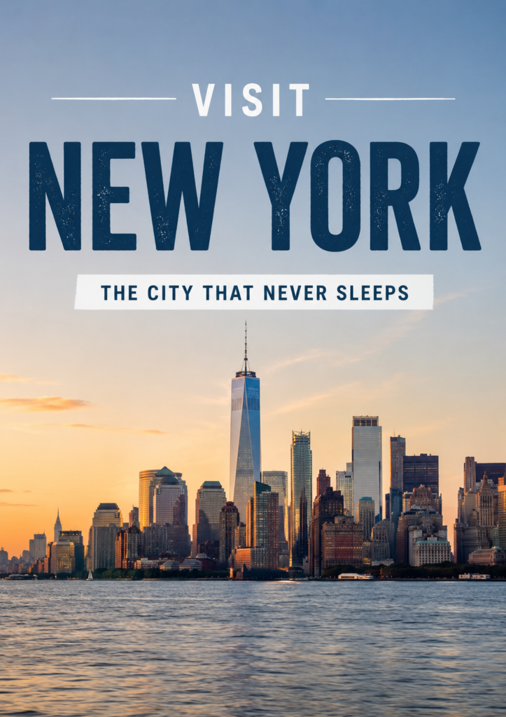
    New York skyline image taken from Safari. Edited and designed using Canva.

    For this design assignment, I created a travel style poster advertising New York City. I wanted the image to feel clean, modern and visually bold while still highlighting the skyline and atmosphere of the city. I chose the phrase “The City That Never Sleeps” because it is one of the most accurate descriptions of New York and helps communicate the energy of the city. My goal was to create a design that looked like a real travel advertisement while also using different layout options.

    To create this poster, I used Canva to combine a skyline image, that I got from safari, with large text and a simple color scheme. One of the main design choices I focused on was dominance. The large “NEW YORK” text immediately grabs attention and becomes the main point of the poster. I also tried to keep the design clean and organized by using only a few colors and limiting extra distractions. The spacing helped make the poster look more professional and easier to read.

    This assignment helped me better understand how text placement and visual design work together to communicate a message. Adding text to an image can definitely change the tone and purpose of a photography. I also realized that simpler designs usually work better than crowded ones because they make it easier for people to focus on the main idea. Overall, this project helped me practice using text, layout, and design balance to create a cleaner and more professional looking poster.

    Related Links

    DS106 Design Assignment Bank:
    https://assignments.ds106.us/types/designassignments/

    Created using Canva:
    https://www.canva.com/

    Additional Media

    https://www.youtube.com/playlist?list=PLO6_l08lsWOij24eAMtIAPNAzRQescreJ

    For additional media, I included a YouTube playlist featuring videos about New York City. The videos showcase many of the famous landmarks, attractions, and city views that make New York a popular travel destination. The playlist helped provide additional context for the city featured in my travel poster.

  • Design Blitz

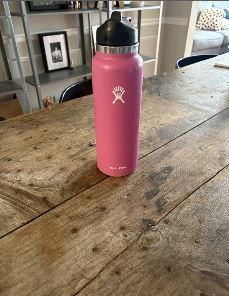
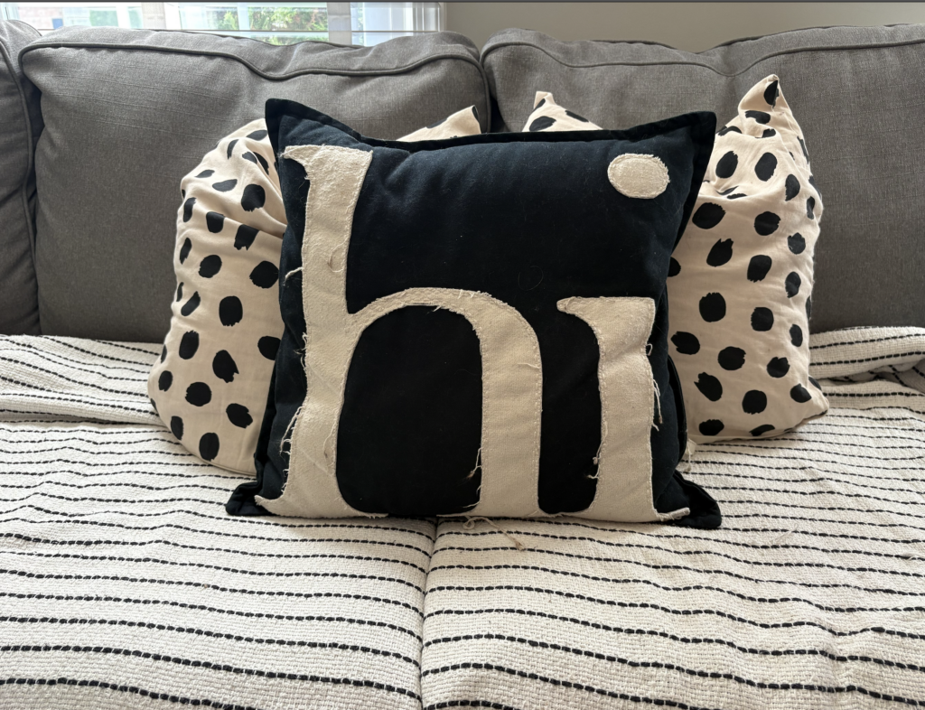
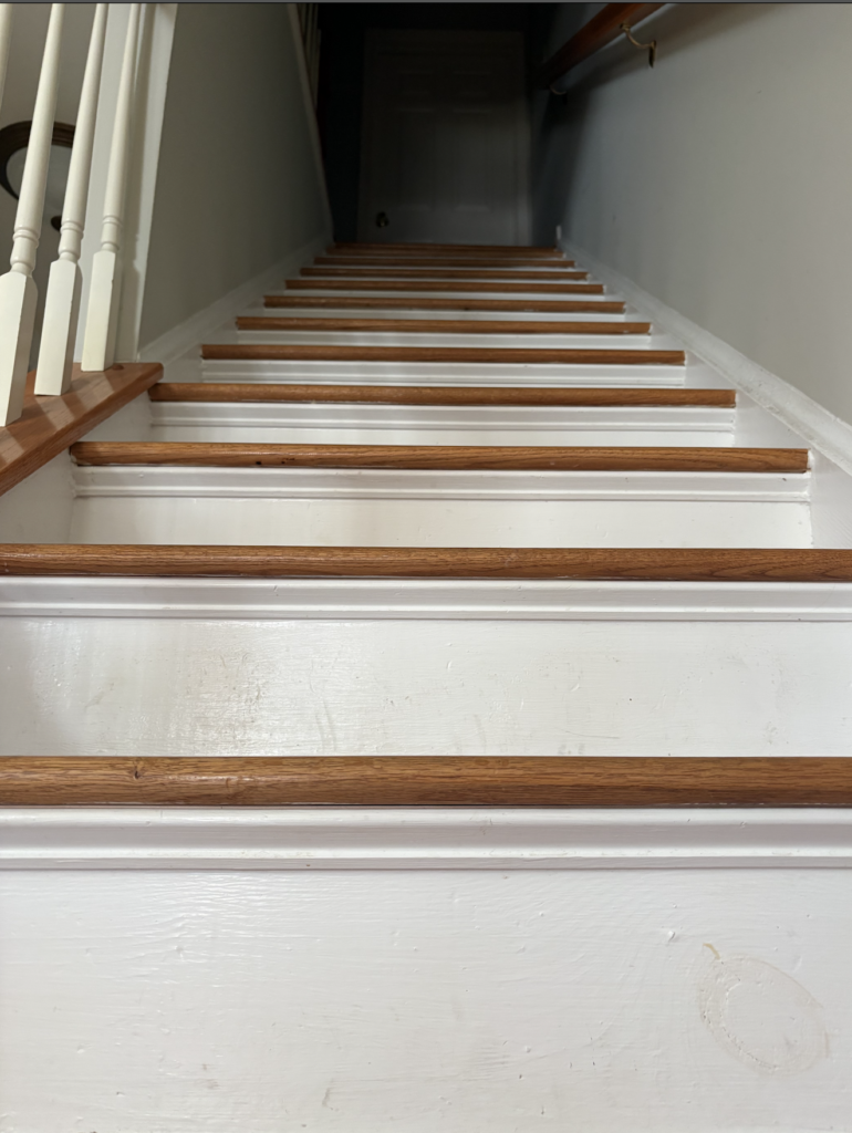
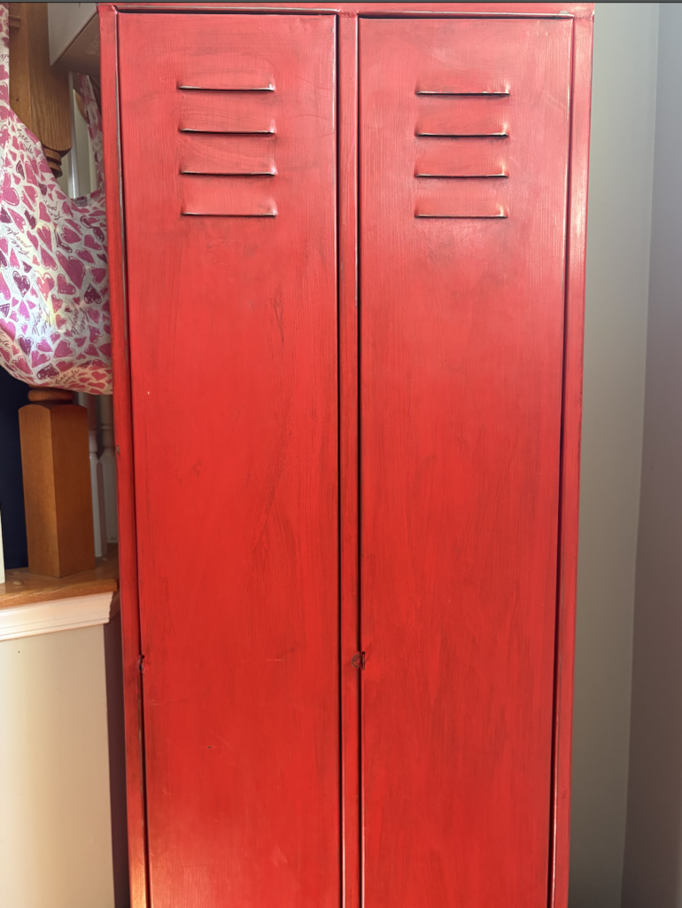
    For this Design Blitz assignment, I photographed different examples of design concepts that appear in everyday life. This project made me pay more attention to how objects, spaces, and layouts are designed around us. The four concepts I focused on were minimalism, balance, rhythm, and dominance.

    Minimalism

    This image demonstrates minimalism and use of space because there is only one main object shown in the photo. The empty space around the Hydro Flask helps keep the image clean and simple instead of cluttered. The plain wooden table and neutral background make the bottle stand out without adding unnecessary distractions. I think this photo is a good example of minimalism because the simple layout makes the image easy to focus on and visually clear.

    Balance

    This image demonstrates balance because the pillows are arranged evenly across the couch. The large black pillow in the center is balanced by the matching patterned pillows on both sides, which makes the image feel stable and organized. The symmetry of the arrangement helps create a calm and visually pleasing design. I think this is a good example of balance because no single side of the image feels heavier or more distracting than the other.

    Rhythm

    This image demonstrates rhythm because the repeating pattern of the stairs creates movement throughout the photo. The repeated lines and shapes guide your eye upward toward the top of the staircase. The consistent spacing between each step helps create a sense of order and repetition. I think this is a good example of rhythm because the repeated design elements make the image visually interesting and organized.

    Dominance

    This image demonstrates dominance because the bright red locker immediately becomes the main focus of the photo. The bold color stands out strongly against the lighter background and surrounding objects, which draws your attention directly to it. The size and placement of the locker also help make it the most visually important object in the image. I think this is a good example of dominance because one element clearly stands out more than everything else around it.