Tag: Design

  • Design Week Summary

    Links to My Design Projects

    Reflection on The Vignelli Canon 

    https://pmccausland.com/assignments/reflection-on-the-vignelli-canon/

    Design Blitz

    https://pmccausland.com/assignments/design-blitz/

    Visit New York

    https://pmccausland.com/assignments/visit-new-york/


    Dessert Display Edit 

    https://pmccausland.com/assignments/dessert-display-edit/

    Times Square Adventure

    https://pmccausland.com/assignments/times-square-adventure/

    Summary Reflection

    Throughout this design unit, I learned that good design is much more than just making something look visually appealing. Design involves careful decisions about color, spacing, typography, balance, and organization. Reading The Vignelli Canon helped me understand the importance of simplicity and creating designs that communicate clearly. I also learned how different design principles can be applied to everyday projects such as posters, photo edits, and advertisements.

    One thing that was harder than I expected was creating designs that looked simple while still being effective. I found that it was easy to add too many effects, colors, or design elements, but much harder to create something clean and organized. Making the Times Square photo edit look somewhat realistic was also challenging because I had to pay attention to placement, size, and overall appearance.

    One thing that was easier than expected was finding examples of design concepts for the Design Blitz assignment. Once I started paying attention to my surroundings, I noticed examples of balance, rhythm, dominance, and minimalism almost everywhere. The photography portion of the project was a lot more enjoyable than I thought it would be.

    The most frustrating part of the unit was making sure every assignment included all of the required parts, such as links, credits, additional media, and reflections. Keeping track of all the assignment requirements took extra time.

    The part I enjoyed most was creating the visual projects. I liked experimenting with Canva and different editing techniques to create posters and photo edits. My favorite project was the New York travel poster because it allowed me to combine photography, typography, and design concepts into one image. Overall, this unit helped me become more aware of how design influences communication and how visual choices affect the way people interpret information.
  • Reflection on The Vignelli Canon

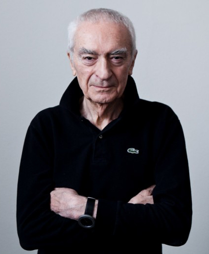
    Image of Massimo Vignelli retrieved from Wikipedia:
    https://en.wikipedia.org/wiki/Massimo_Vignelli

    One thing that stood out to me while reading The Vignelli Canon by Massimo Vignelli was how strongly he believed that design should be simple, organized, and meaningful. Instead of making things overly complicated or trendy, Vignelli focused on clarity and structure. I thought it was interesting when he said good design should be clear and not have extra distractions. His ideas about grids, fonts, and spacing helped me realize that even simple designs take a lot of planning. I also liked when he said “design is one” because it showed that the same design ideas can be used for many different kinds of projects.

    The part I found most useful was Vignelli’s focus on timelessness and discipline in design. He argued that designers should avoid creating work that only follows temporary trends because trends quickly become outdated. Instead, he believed good design should last for a long time and still work well years later. This made me think about logos and advertisements that still look professional even after many years. I also liked his ideas about consistency. He explained how grids, alignment, and typography help keep a project organized and balanced. Reading this made me realize that cluttered designs can be confusing, while simple designs are much easier to understand.

    Some of the principles from The Vignelli Canon that I would apply in my own design work are simplicity, balance, and organization. When making projects for class or creating social media posts, I sometimes add too many different colors, fonts, and effects because I think it makes the design look better, even though it usually does not. After reading this booklet, I realized that keeping a design simple can actually make it look stronger and more professional. I also want to pay more attention to spacing and alignment because those small details help make designs cleaner and easier to read. Overall, The Vignelli Canon helped me better understand how design choices affect communication and why good design is more than just making something look flashy.

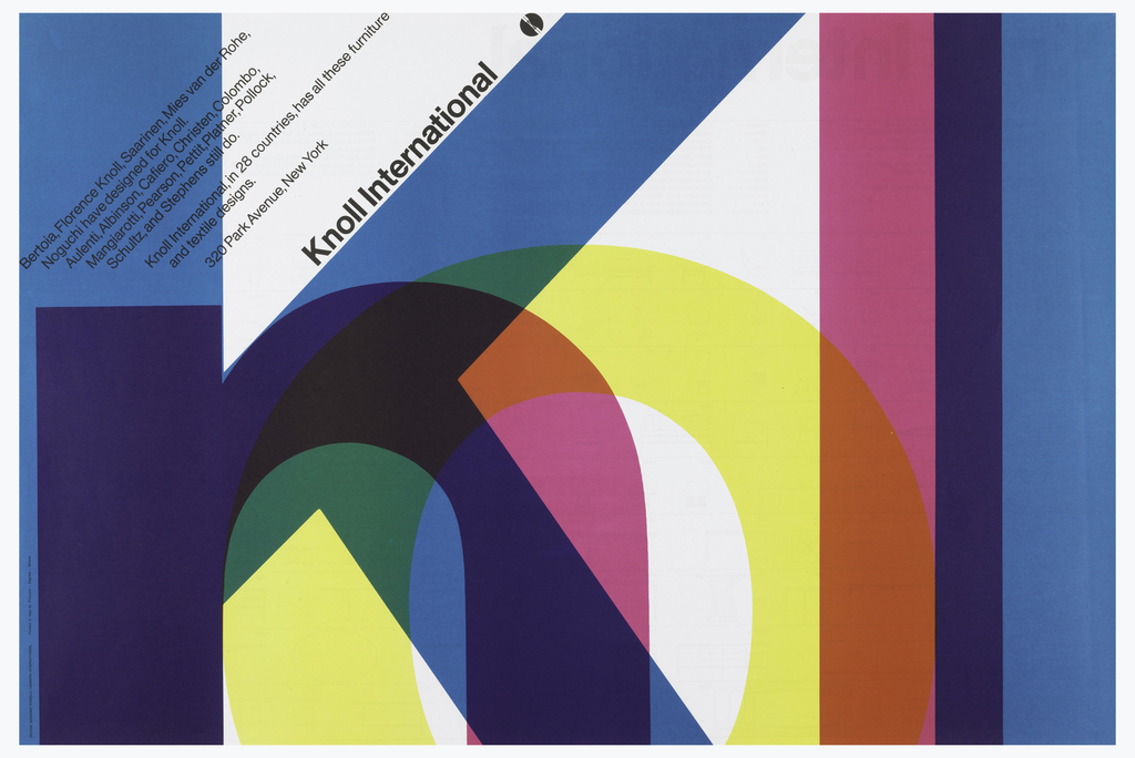
    Knoll International poster designed by Massimo Vignelli. https://www.cooperhewitt.org/2018/05/04/a-colorful-identity-2/

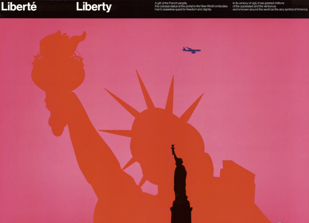
    Statue of Liberty poster designed by Massimo Vignelli.

    https://artsandculture.google.com/asset/liberty-liberté-vignelli-massimo/rwG3OPRS7BVJDA